MOREPublishers present:
New editions
by KOENRAAD DEDOBBELEER and by KATINKA BOCK
Saturday 25th April, from 2pm to 6pm
Rectangle, Brussels

Cult cartoonist, rebel and iconoclast, Pierre La Police is a contemporary artist defying classification. His work is sourced, and finds critical power, in the narrative processes of comic strips, and more generally in the formal aspects of media spin and popular culture.
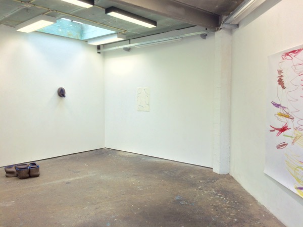
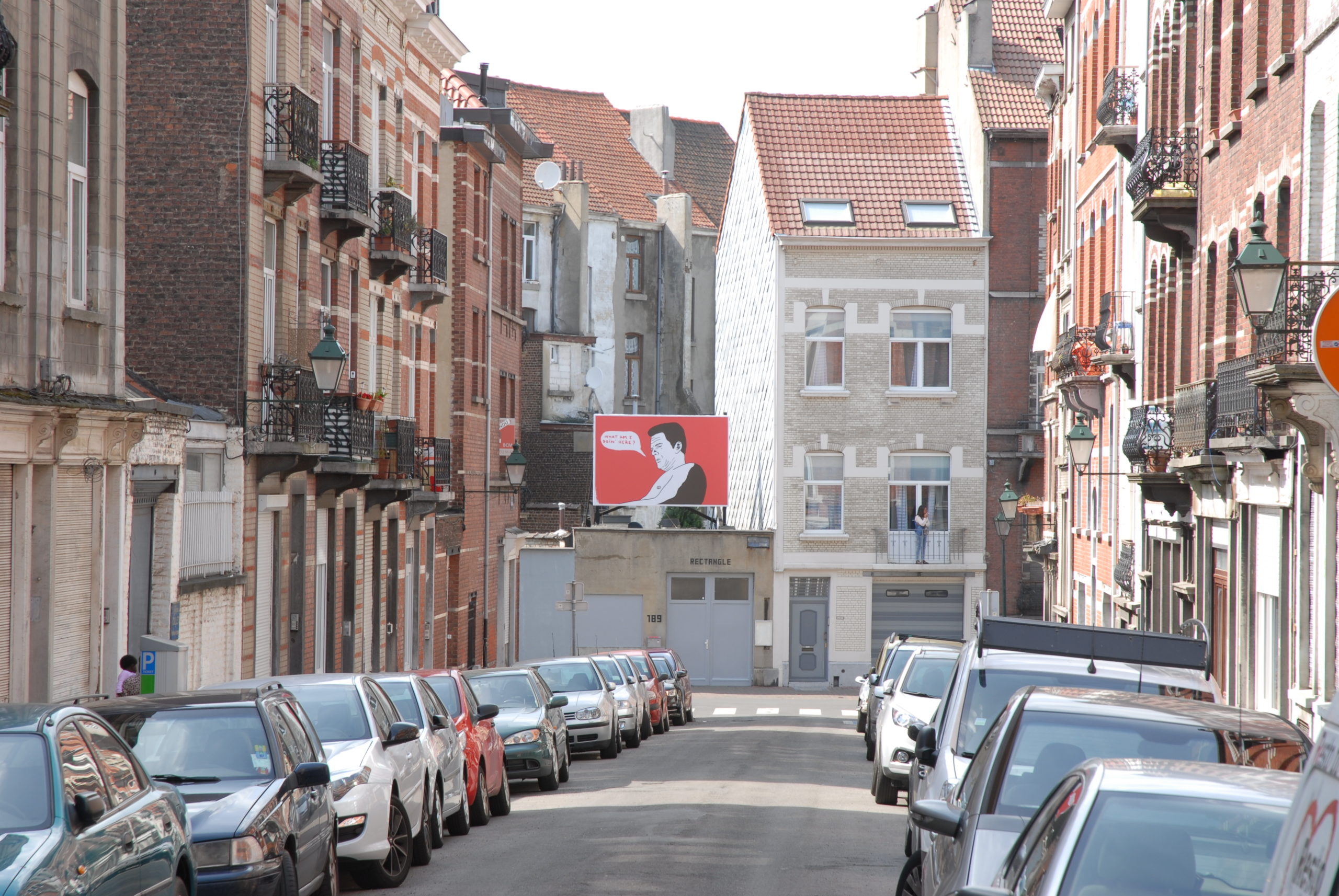
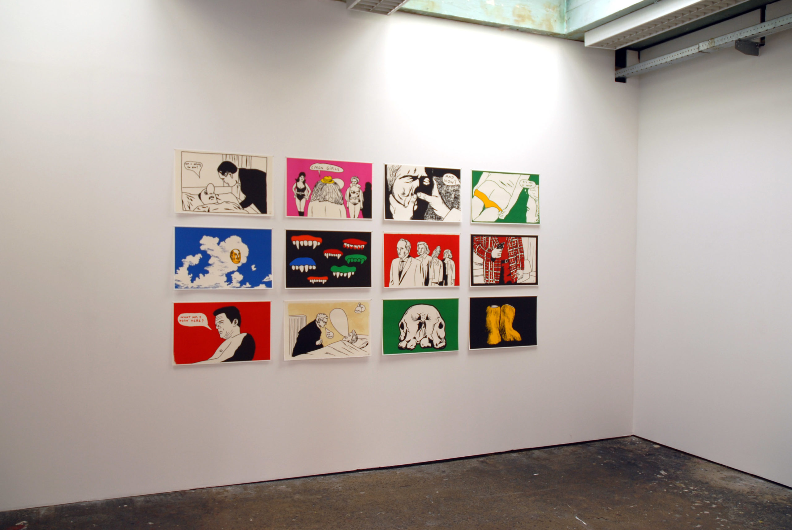
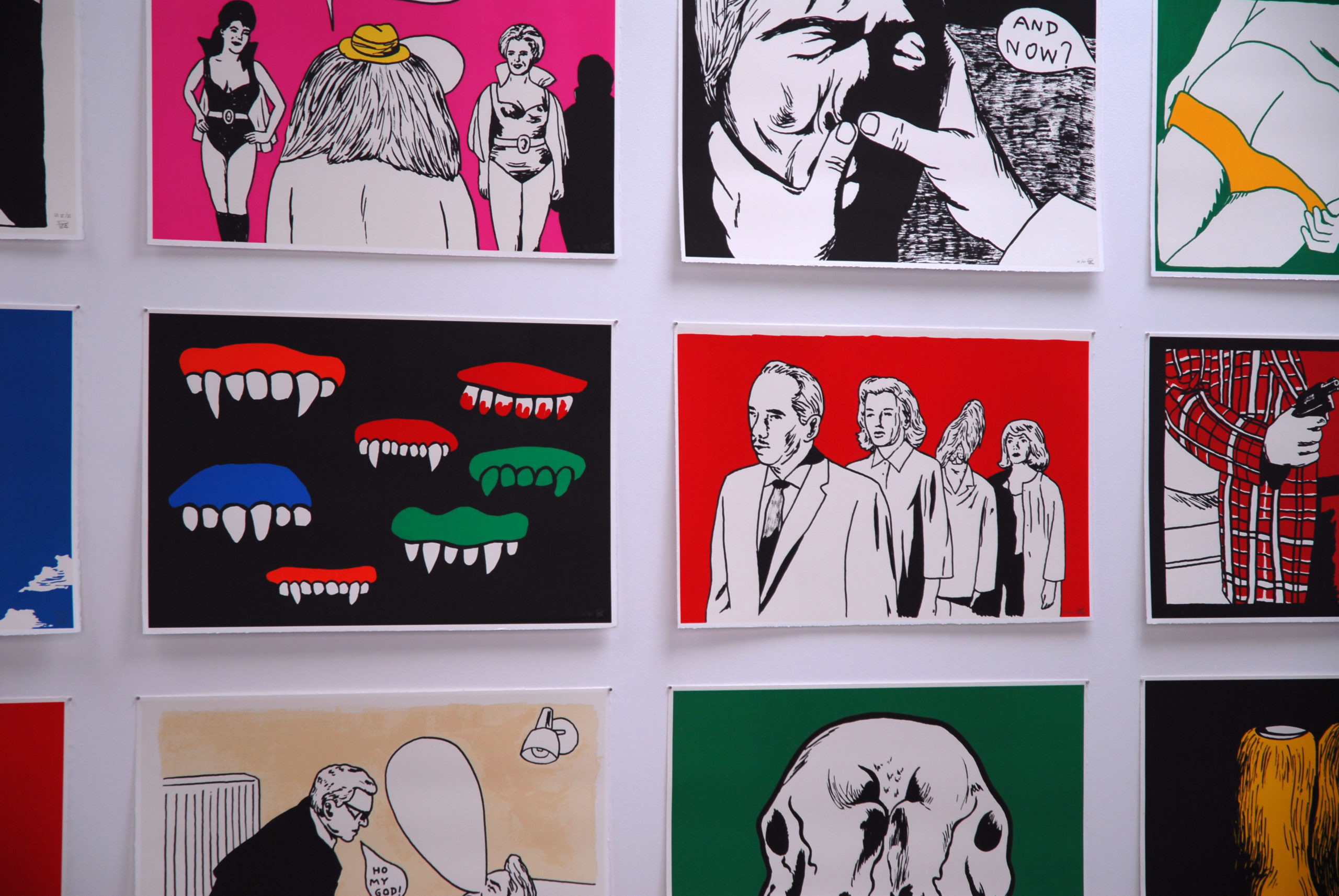
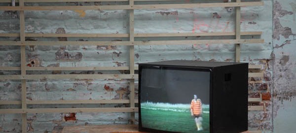
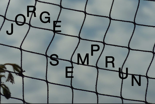
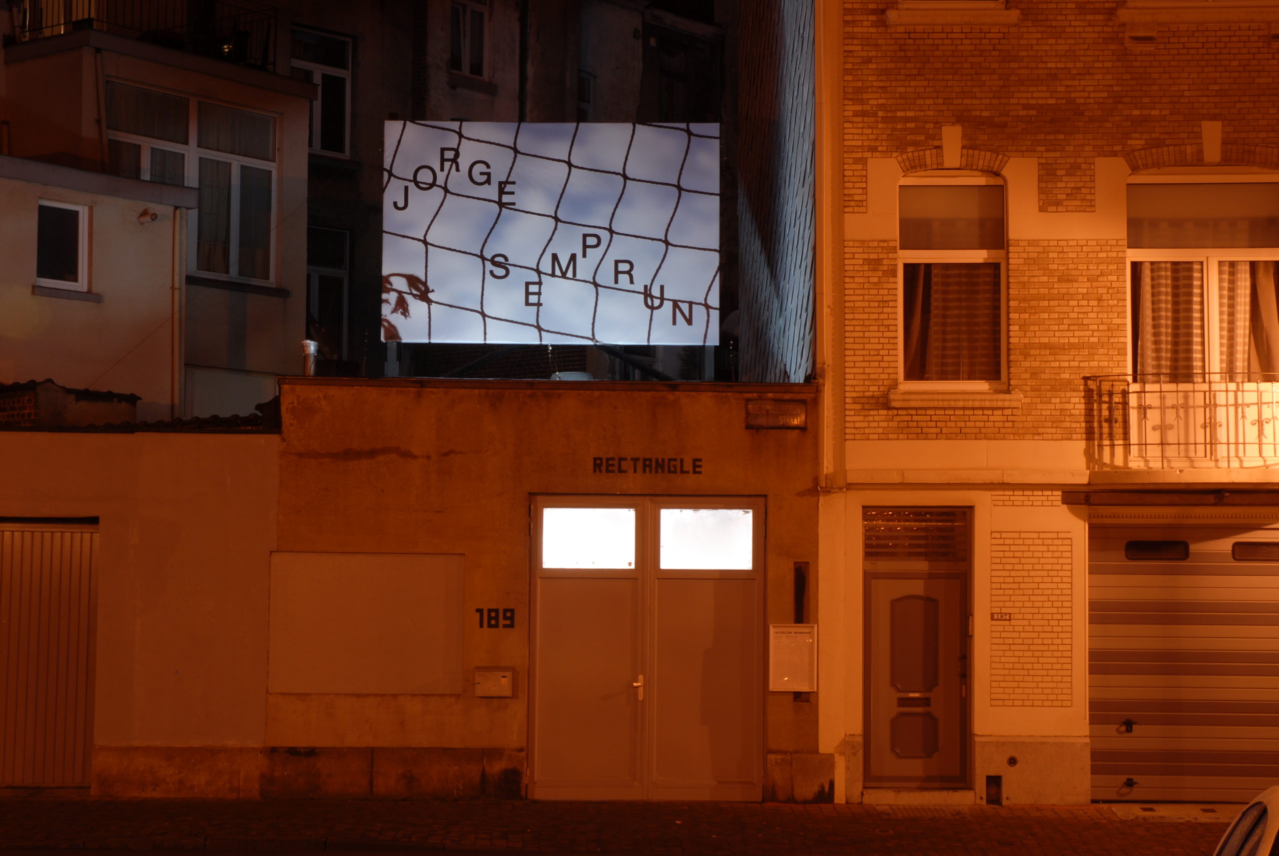
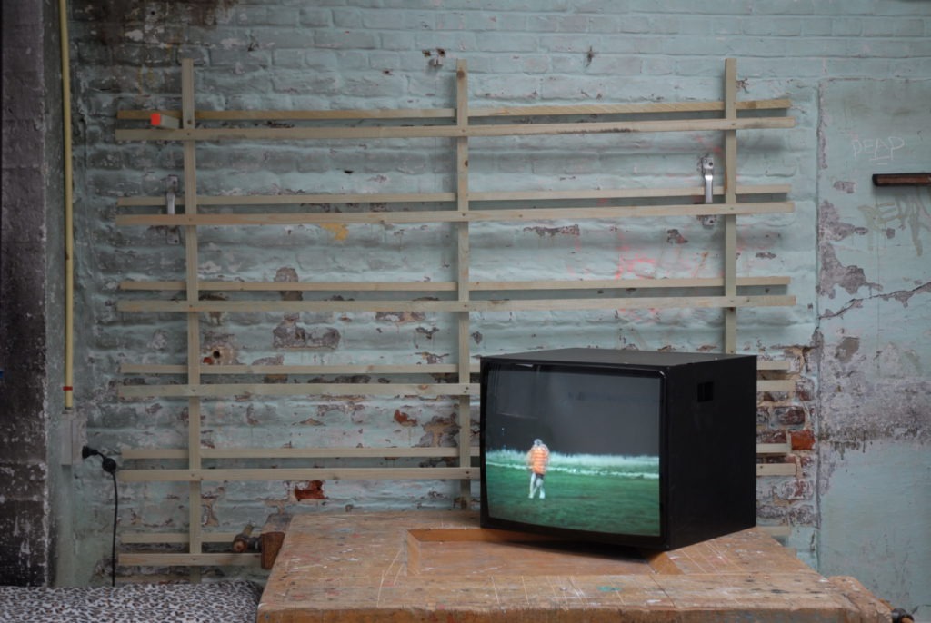
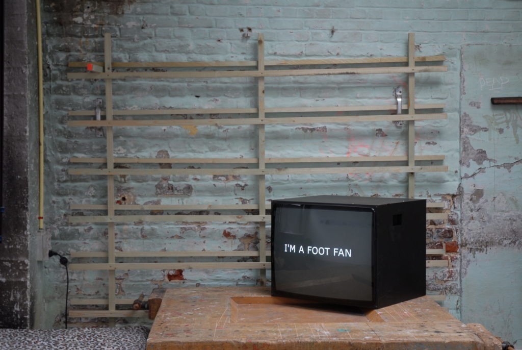
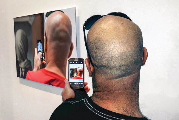
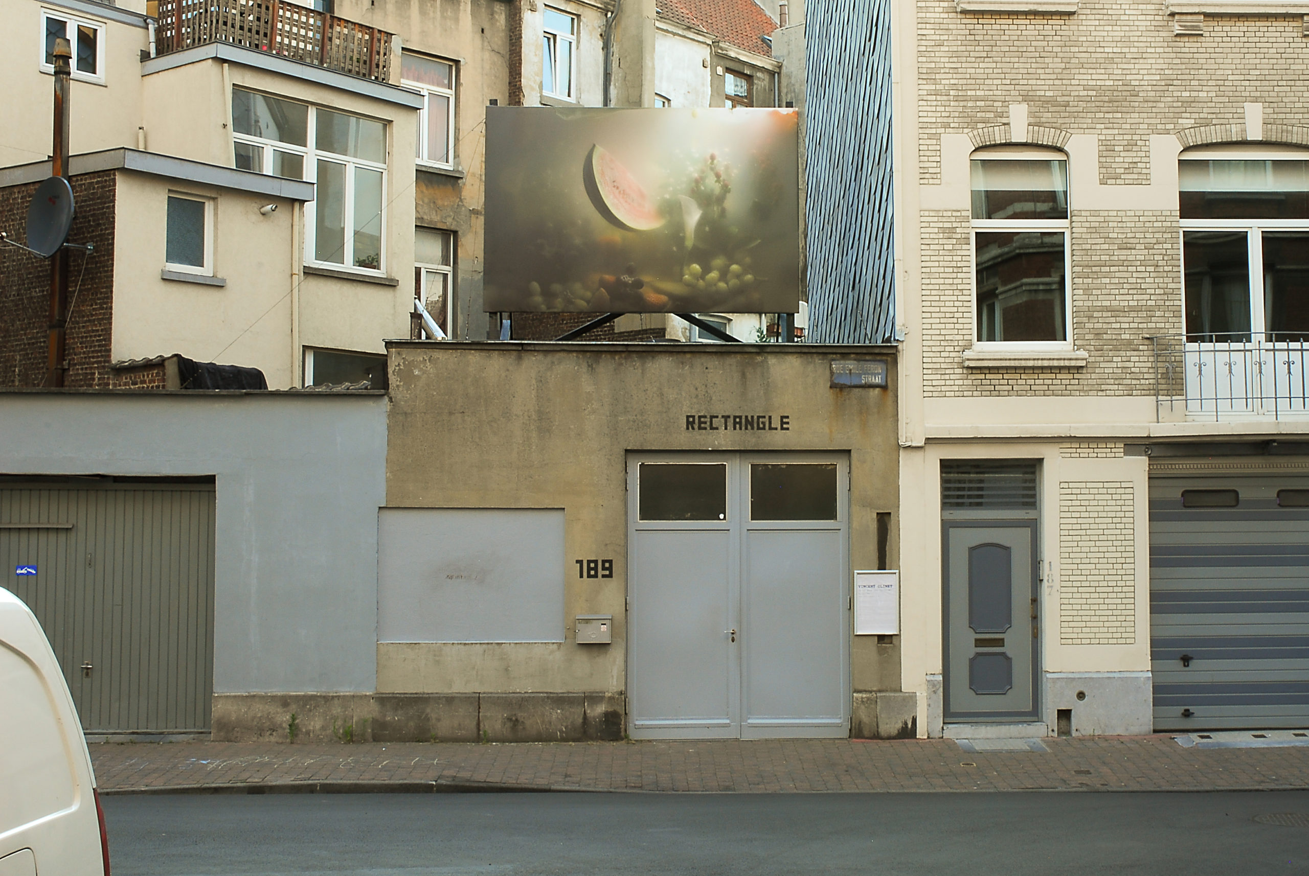
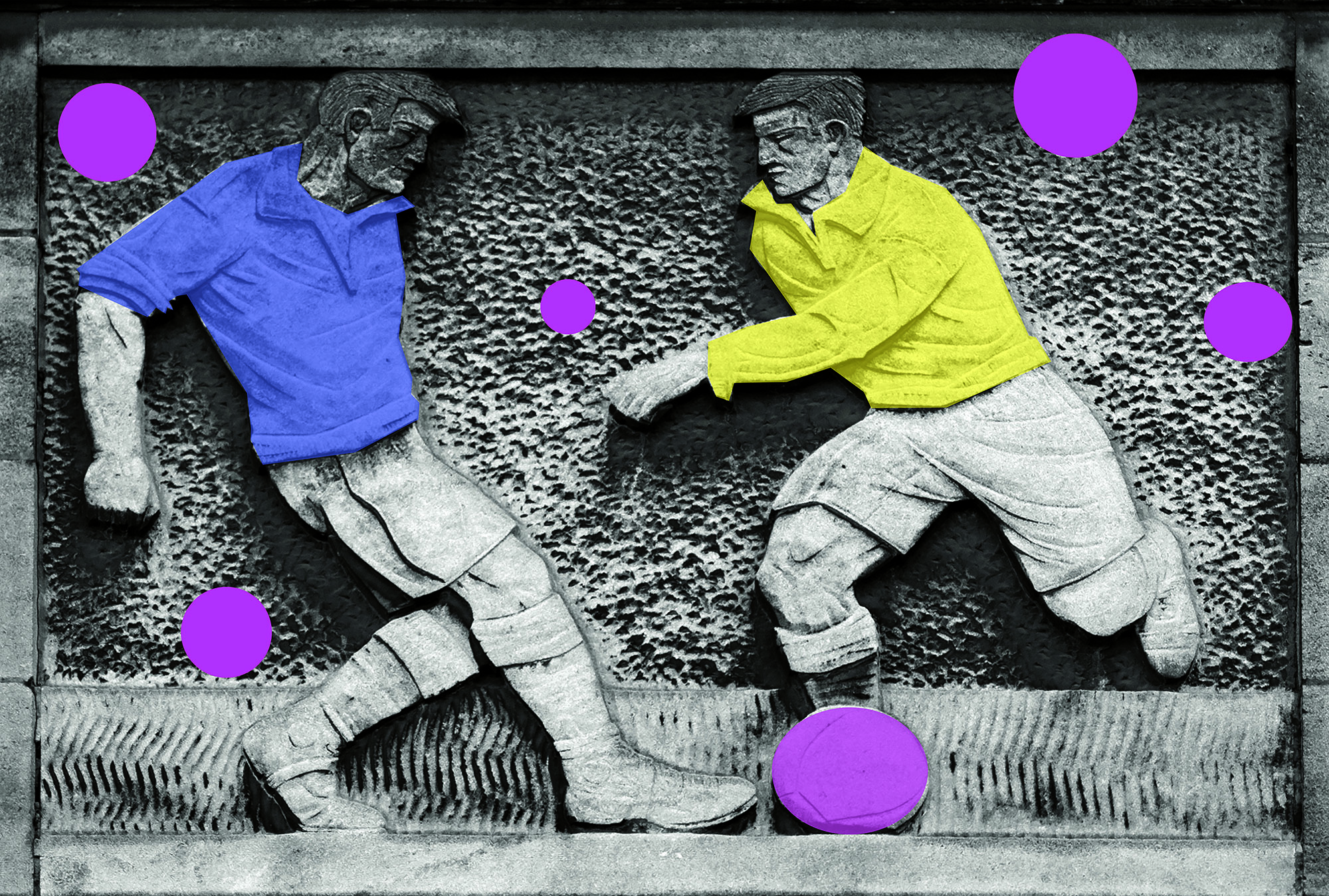
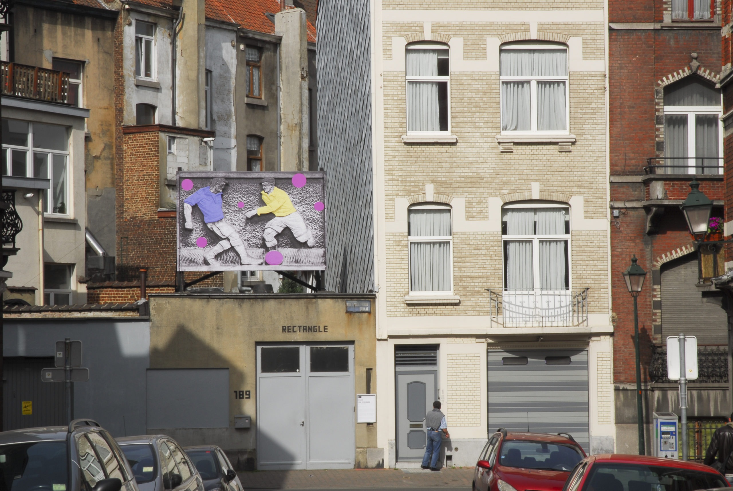
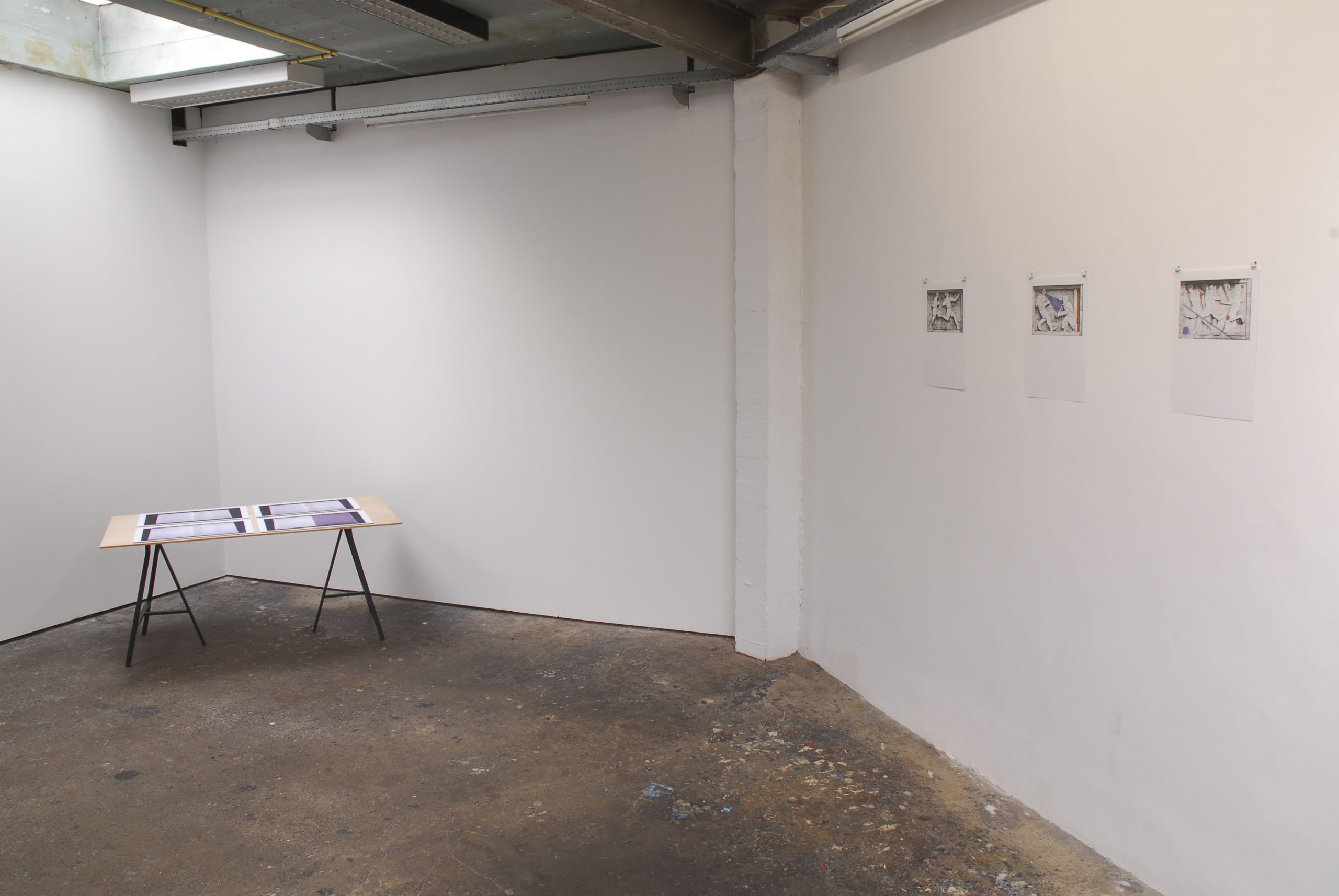
For Rectangle, PLP puts forward an image that originates from a series of 12 prints, enlarged for a public space setting and offering the passer-by as much an opportunity for reflexive questioning as for a smile.
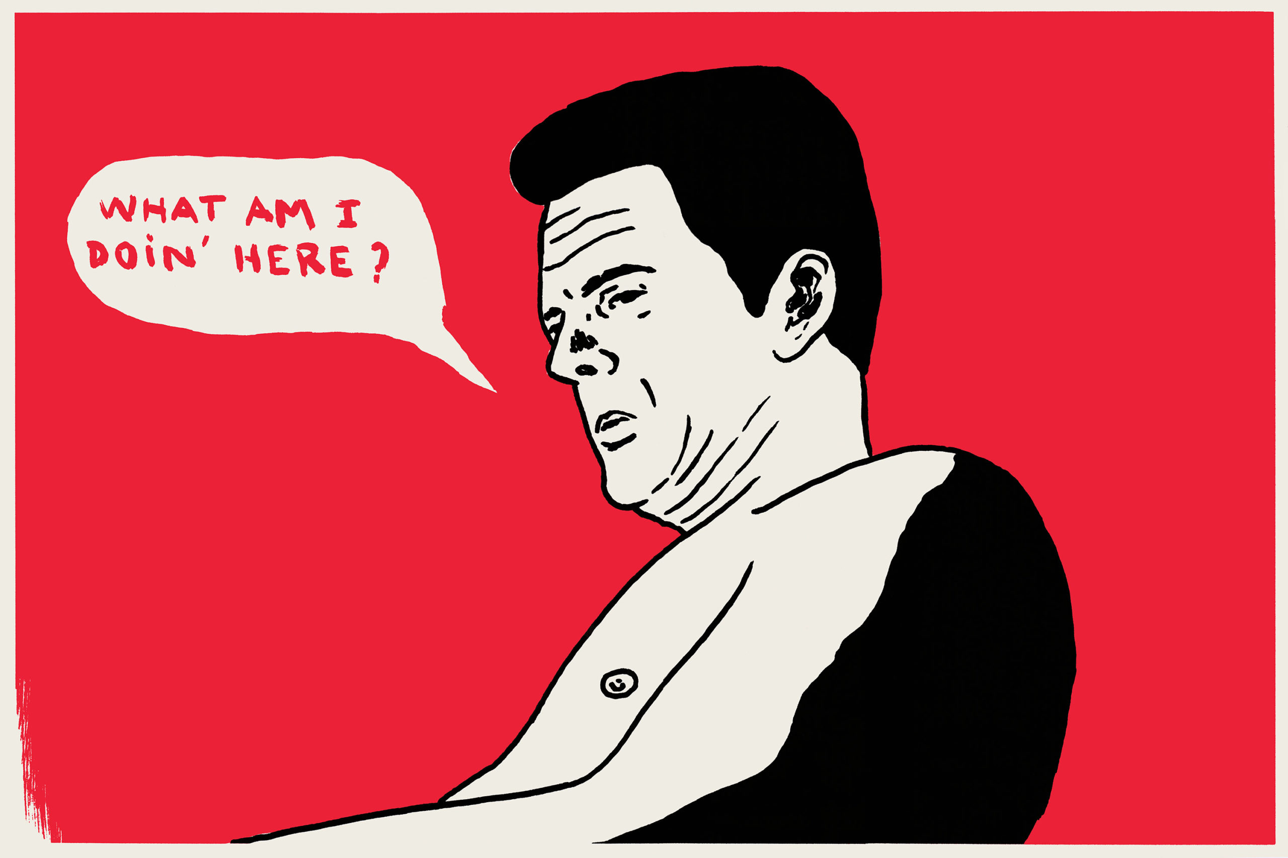
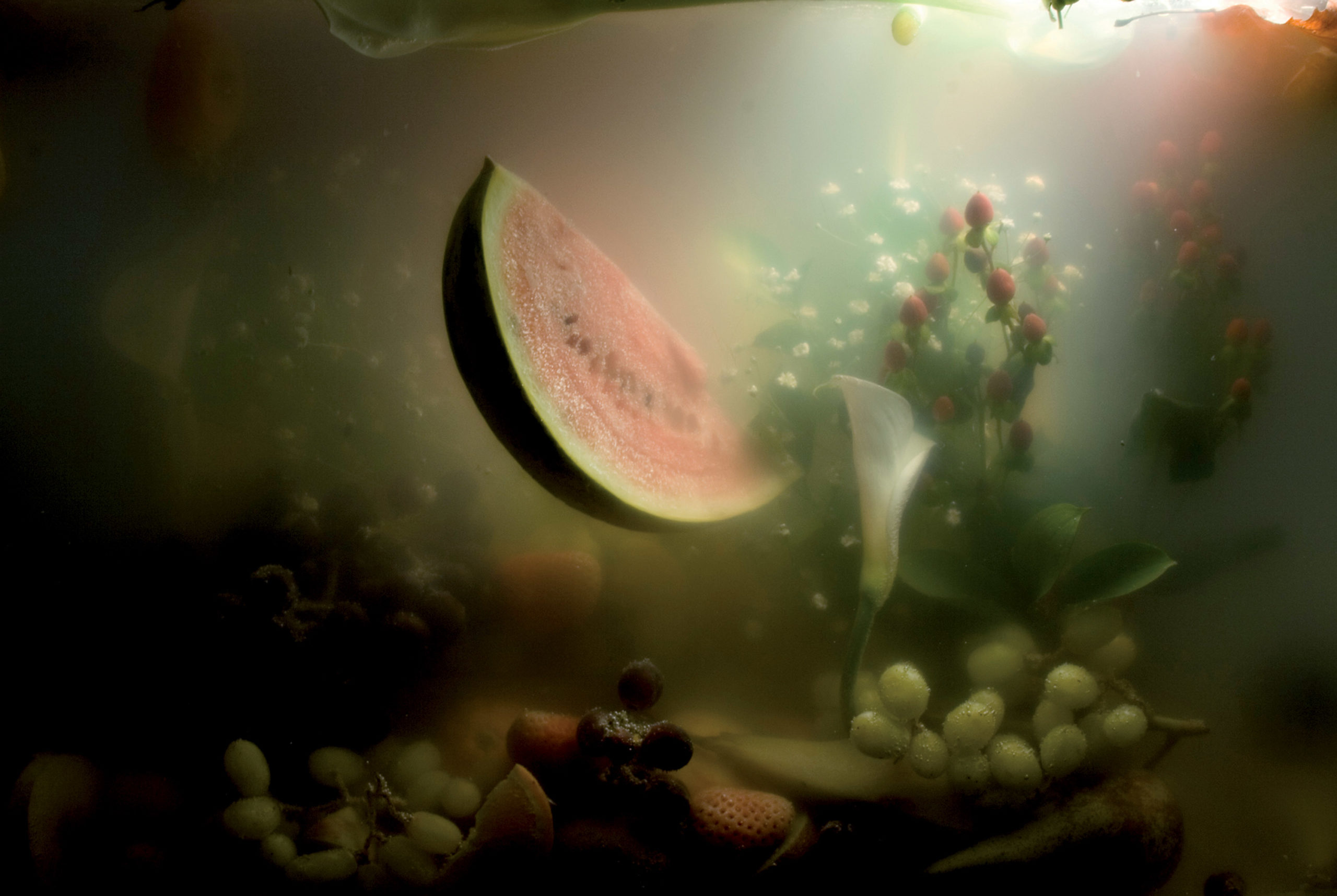
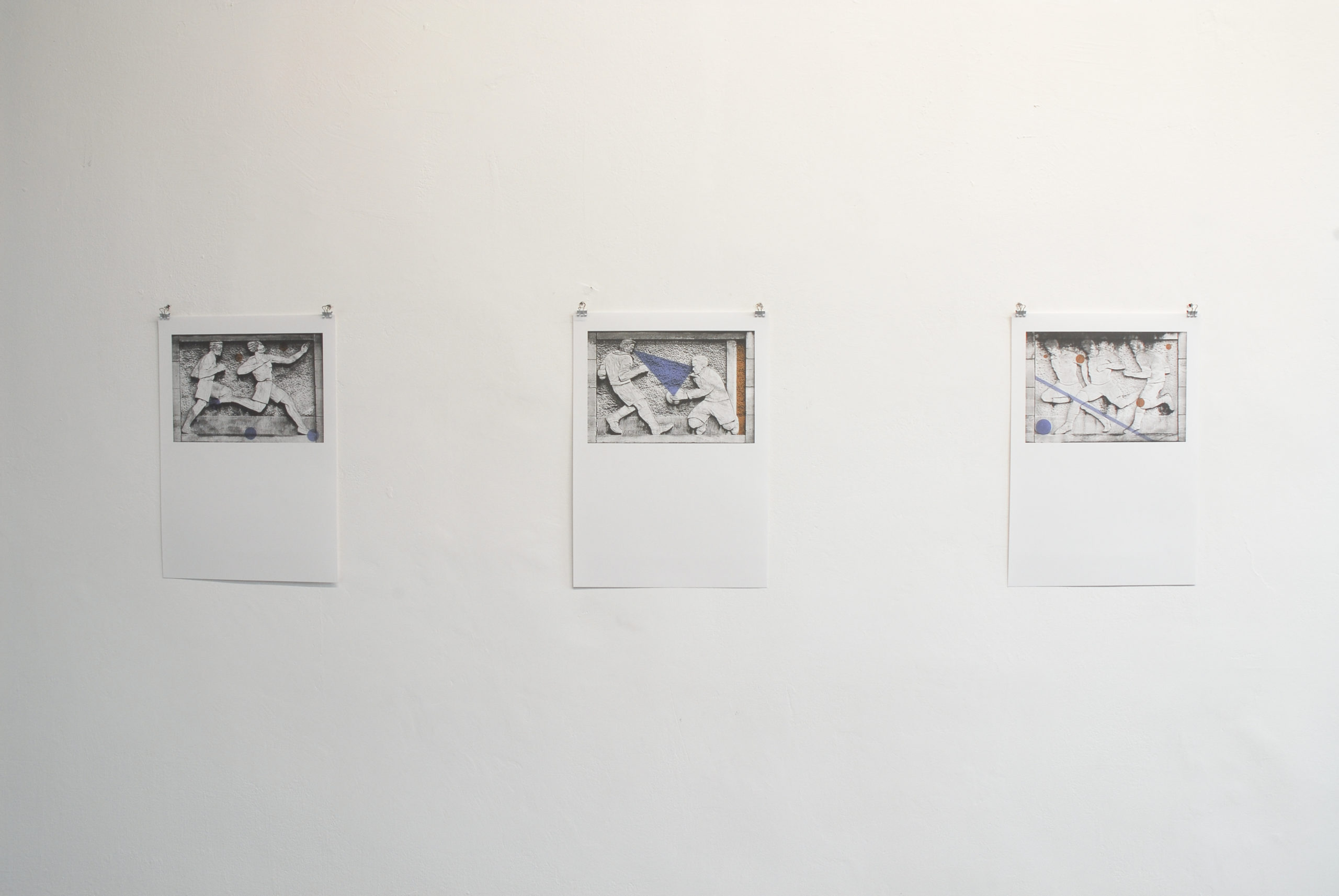
The result of the most careful printing work, each 62×40 cm-formatted board develops the humorous universe of Pierre La Police, an uncategorizable yet recognisable artist. The images either focus on an incongruous detail (hairy yellow boots) in the style of a movie close-up, or on a ‘malfunctioning’ cutaway (a gangster where neither head nor feet are captured but only his middle), or a scene straight from an obscure cartoon strip (a low angled shot of a man proclaiming “what am I doin’ here?”). Some boards portray a surreal world: a man’s head fluttering around a smoky cartographic landscape, a fixed grin with exaggerated teeth evoking nightmarish scenes, a hybrid form hesitating between the animal and mineral kingdoms. The strange frames disrupt representations that are no less so.
Worrisome (a doctor leans on a deformed being who asks “Am I going to die?”), situations quickly become grotesque or mysterious, laughable in their perplexity. Boards resting on unstable affects create an inimitable atmosphere. Absurd details conspicuous in their density, make one think of David Lynch, but with Pierre La Police tension turns to a rare kind of fantastical, off the wall comedy. An immediate unity in form links these incongruous scenes: flat monochromes, mostly confident black lines, the random presence of speech bubbles. Weird and clichéd (surfers, bureaucrats, pin-ups), Pierre La Police’s characters are types of human. They live alongside implausible and misshapen beings that have gently infiltrated them. Thus, on a blood red background, out come four figures from a 1950s works council, but one of them is an alien imposter. The purpose of this simple art, although marked with deliberate awkwardness, is to threaten an all too peaceful reality by incessantly sabotaging normality. To this end, Pierre La Police, likes to mix legitimate and brut art forms, popular and underground; cinema, comics, desktop wallpaper, fotonovelas, stickers etc. The contrast between the quality of the boards and the cheap, derisory imagery they depict works perfectly. From spanning print offsetting to the noble art of lithography, Pierre La Police wins poetic gravitas.
Thomas Clerc – Janvier 2008
Dessinateur culte, hors-la-loi et iconoclaste, Pierre La Police est un artiste contemporain inclassable dont le travail trouve sa source et sa puissance critique dans les procédés narratifs de la bande dessinée et, d’une manière plus générale, dans les aspects formels du langage des médias et de la culture populaire.
Pour Rectangle, PLP propose une image issue d’une série de 12 estampes qui, agrandie au format de l’espace public, offre au passant l’occasion d’un questionnement réflexif autant que celle d’un sourire.
De format 62×40 cm, chacune des planches, fruit d’un travail d’imprimerie des plus soignés, décline l’univers drolatique de Pierre La Police, artiste inclassable et pourtant identifiable. Les images se focalisent soit sur un détail incongru (des bottes en poils jaunes) à la manière du close-up de cinéma, soit sur un plan de coupe « raté » (un gangster dont on ne voit ni les pieds ni la tête est saisi par le milieu), soit sur une scène tirée d’une bande dessinée obscure (un homme en contre-plongée déclare « what am I doin’here ? »). Certaines planches dessinent un monde surréel : une tête d’homme volette dans un paysage cartographique en fumée, des rictus à la dentition outrée évoquent des scènes de cauchemars, une forme hybride hésite entre règne minéral et animal. Les cadrages étranges perturbent des représentations qui ne le sont pas moins.
Inquiétantes (un médecin se penche sur un être difforme qui demande « am I going to die ? »), les situations tournent vite au grotesque ou à l’énigmatique et font rire en déroutant. Comme chaque planche repose sur des affects instables, une ambiance inimitable s’installe. Les détails saugrenus, saisis dans leur densité, font parfois penser à David Lynch, mais chez Pierre La Police la tension se résout dans un comique d’une nature rare, onirique, décalée. Une unité plastique immédiate relie ces scènes incongrues : à-plats monochromes, traits noirs plus ou moins assurés, présence aléatoire de phylactères. Bizarroïdes ou surconnotés (surfeurs, bureaucrates, pin-ups), les personnages de Pierre La Police sont des sortes d’humains. Ils cohabitent avec des êtres invraisemblables et difformes qui les auraient contaminés en douce. Ainsi, sur un fond rouge sang, quatre figures sorties d’un comité d’entreprise des années 50 se détachent, mais l’un d’entre eux est un infiltré extra-humain. Le propre de cet art épuré quoique empreint d’une maladresse concertée, est de menacer la réalité trop tranquille par un incessant sabotage de la normalité. Pour ce faire, Pierre La Police aime à mixer des arts légitimes et dégradés, populaires et confidentiels : cinéma, comics, fonds d’écrans, romans-photos, vignettes, etc. Le contraste entre la qualité des planches et l’imagerie cheap ou dérisoire qu’elles convoquent fonctionne parfaitement. En passant de l’offset au noble art de la lithographie, Pierre La Police gagne en force poétique.
Thomas Clerc – Janvier 2008
Cult-tekenaar, wetteloos en iconoclast – Pierre La Police is een niet te categoriseren hedendaags kunstenaar. De bron en de kritische kracht van zijn werk situeren zich in de naratieve procedures van het stripverhaal, en meer in het algemeen in de formele aspecten van media-taal en populaire cultuur.
Voor Rectangle stelt PLP één beeld voor uit een reeks van 12 prints, die – uitvergroot en aangepast aan de publieke ruimte – zowel kritische reflectie als een lach teweegbrengt.
Elke print , telkens 62 x 40 cm, het resultaat van een verzorgde grafische aanpak, toont het grappige universum van PLP- niet te categoriseren en toch herkenbaar kunstenaar.
De beelden concentreren zich op bizarre details (vb. Laarzen van gele vacht) in een stijl die gelijkaardig is aan close-ups in cinema. Gerateerde cadrages (vb. Een gangster waarvan we de voeten noch het gezicht zien.), of scenes uit obscure stripverhalen (vb. Een man gezien vanuit kikker perspectief verklaart ‘What am I doin’here ?’)
Sommige prints tonen een surreële wereld : Het paarse hoofd van een man in een cartografisch landschap dat baadt in rook, een grijns die een nachtmerrie doet ontstaan, een hybride vorm die twijfelt tussen mineraal tijdperk en dierenrijk…. Cadrages die er voor zorgen dat de representatie op de helling komt te staan.
Verontrustende scenes(een arts die zich over een vervormd wezen buigt dat zich afvraagt ‘am I going to die ?’) die nijgen naar het groteske of enigmatische en tegelijkertijd doen lachen.
Elk beeld uit de reeks is gebaseerd op een instabiele aantrekking en installeerd een onnavolgbare sfeer. De vreemde gecondenseerde details doen soms denken aan David Lynch, doch bij PLP lost de spanning zich op in een vreemde komische aard, droomachtig, verplaatst en vervreemd. Een plastiche directe éénheid verbinden bervreemdende scènes. Monochrome vlakken, zwarte sporen die min of meer verzekerd aandoen. Rariteiten en zeer bepaalde groepen (vb. Surfers, bureaucraten, pin -ups etc.)- de personnages van PLP zijn ‘een bepaalde soort van mensen’. Ze leven samen met vreemde en vervormde wezens die hen besmetten.
Op een bloedrode achtergrond, 4 personages uit de jaren ‘50 die net een bedrijfsvergadering hebben verlaten, waarvan één onder hen een geïnfiltreerd buitenaards wezen is. De eigenschappen van dit werk zijn de combinatie van uitgezuiverde plasticiteit en bewuste onhandigheid, en het aanvallen van een te rustige realiteit door het saboteren van normaliteit.
PLP vermengt legitieme en gedegradeerde kunst- populair en vertrouwde media : cinema, strip, screensavers, foto romans, etc… Het contrast tussen de plastische kwaliteit van de prints en de goedkope of inwisselbare beeldtaal werkt perfect. Door het vertalen van populaire offset techniek naar lithografie wint het werk van PLP aan poëtische kracht.
Thomas Clerc – Janvier 2008
Pierre La Police
Born in 1959 in France.
Lives and works in Paris.
www.pierrelapolice.com
Good evening Jacqueline,
Yes it was Jorge, Jaime’s father, who was in the image that you were referring to. He is the one who ran away from Franco, who was deported and wrote about the Camps, who joined the exiled Spanish Communist Party, and went on to be a screenwriter for Costa Gavras and Alain Resnais.
And yes, it is his son Jaime who had ties to the Situationist International. The confusion probably comes from the fact they died within one year of each other: Jaime in 2010, Jorge in 2011.
Have a nice evening!
Cédric
Dear Cédric,
It seems I intuitively decided to name Semprún, who I had never read, but whose name brought to my mind movies from 60’s and 70’s… A rich time, full of new vibrations, enthusiasm and ideals. We watched “Z”, “La guerre est finie” and all the movies he wrote condemning the dictatorships of that age. Over time we no longer heard his name, and his movies ended up in the archives of film history.
Twice in 2014 I heard his name mentioned and his work being praised on the radio. Recollection hit me and I wanted to go deeper. Your billboard project was a good way for all of us to learn more. Stirring curiosity to teach and share, because he is by no means a soccer star!
He’s a reserved man, an elegant observer of human behavior, in turn irritated and amused. He writes tenderly about innocence, the old bourgeoisie and his father: a man out of time. He makes us laugh. He talks about his time in The Hague, Belgian custom officials, their hats, their way of overdoing it………….
Wishing you a good night.
Jacqueline
Bonsoir Jacqueline,
C’est bien Jorge, le père de Jaime, que vous évoquiez dans votre image. C’est bien lui aussi qui fuit l’Espagne de Franco, connu et écrivit sur les camps, s’engagea au Parti Communiste Espagnol exilé, et fut scénariste de Costa Gavras et Alain Resnais.
Et c’est bien son fils, Jaime qui fut lié à l’internationale situationniste. La confusion vient sûrement du fait qu’ils sont morts à un an d’intervalle, le fils en 2010 et le père en 2011.
Belle soirée!
Cédric
Cher Cédric,
Il me semble que j’ai intuitivement choisi de nommer Semprún, que je n’avais pas lu, mais dont le nom évoquait des films montrés dans les années 60 / 70… une période riche de nouvelles vibrations et d’enthousiasme, d’idéal aussi. Nous allions voir “Z”, “La guerre est finie” et tous les films dont il était le scénariste, dénonçant les dictatures de l’époque. Et puis au fil du temps, on n’entendait plus ce nom et les films passaient dans les collections des cinémathèques.
En 2014, par 2 fois, venant de la radio, j’entends ce nom et des éloges. Cette réminiscence “a fait mouche” et j’ai voulu en savoir plus. Votre projet de calicot était idéal pour que nous en sachions tous plus. Ceci est un réflexe d’enseignement et de partage. Intriguer pour chercher: Non, ce n’est pas une vedette de foot !
C’est un homme de la discrétion tout en élégance et humanité, un observateur agacé ou amusé. Il écrit des passages très tendres de la naiveté, ancienne bourgeoisie, de son père complètement hors du temps; cela provoque le rire; Il parle de son séjour à La Haye, des casquettes des douaniers belges qui font de l’excès de zèle………….
En vous souhaitant bonne nuit.
Jacqueline
Goedenavond Jacqueline,
Het is inderdaad Jorge, de vader van Jaime, waar u in uw afbeelding naar verwees.
Het is zeker ook hij die het Spanje van Franco ontvluchtte, in een kamp opgesloten zat en erover schreef, zich aansloot bij de Spaanse Communistische Partij in ballingschap, en de scenarioschrijver was van Costa Gavras en Alain Resnais.
En het is ook zijn zoon, Jaime, die gelinkt was aan de Situationist International.
De verwarring stamt waarschijnlijk uit het feit dat ze beiden stierven met een jaar interval, de zoon in 2010 en vader in 2011.
Nog een mooie avond!
Cédric
Geachte Cédric,
Het lijkt mij dat ik intuïtief gekozen heb om Semprun te vernoemen, die ik niet gelezen heb, maar wiens naam films oproept vertoond in de jaren ‘60 en ‘70 … een rijke periode met frisse vibes, enthousiasme en idealen. We gingen kijken naar “Z”, “La guerre est finie” en alle films waarvan hij de scenario’s schreef, die de dictaturen van die tijd aan de kaak stelden. Na verloop van tijd hoorden we deze naam niet meer en verdwenen de films in de archieven van de cinematheken.
In 2014 hoorde ik 2 keer op de radio die naam opnieuw, en veel lof. Deze herinnering blies me van mijn sokken en ik wilde meer weten. Jullie billboard project was de perfect manier om samen te ontdekken. Dit is een educatieve en collectieve reflex, intrigerend en een aanzet tot dieper kijken, want nee, het is zeker geen voetbalvedette!
Het is een discreet man, elegant en diep menselijk, een geïrriteerd of geamuseerd waarnemer. Hij schrijft passages met de zachtheid van de naïviteit over de oude bourgeoisie, over zijn oubollige vader; en dat zet aan tot lachen; Hij vertelt over zijn verblijf in Den Haag, de hoofddeksels van de overijverige Belgische douaniers………….
Ik wens u een goede nacht.
Jacqueline
Jacqueline Mesmaeker
Born in 1929 in Belgium.
Lives and works in Brussels.
Vincent Olinet
Born 1981 in France.
Lives and works in Paris.
www.vincentolinet.com
INTERVIEW
The image chosen for the billboard is one of a series of seven, composing Filip Van Dingenen’s proposal for Rectangle: an analytical exploration of the bas-reliefs integrated in the facade of the stadium of Royal Union Saint-Gilles (Josef Marien Stadium) by the Belgium sculptor Oscar de Clerck (1892 – 1968). The project investigates the history of the depiction of football clubs, from the teams’ black & white photography to full colour digital photography.
Using or copying a methodology / strategy similar to a choreographers rehearsals in the dance studio, this exploration focuses on position, composition and speculating on the movement of the sportsmen.
What is the meaning of the title: MAS PRESENTE! It’s Spanish right? Why?
Yes it is, for me it is the language of drama.
It is the scream of a coach. Thinking of will, perseverance and discipline. But at the same time I see an image of the impotence of a coach standing in the rain along the pitch while his team fails.
You live very close to the stadium of St Gilles, and to Rectangle too. There is with the choice of this subject something of a ‘local’ investigation, but drifts to more general and historical concerns. This drift seems to feature in your work in general.
Can you talk about that?
Le Cercle d’histoire or the Heemkundige Kring has often a musty reputation. It is an organisation you can find everywhere in the world, mostly managed by amateurs passionated by local history. Wherever I go to develop a project (the Burren -Ireland, Banff – Rocky Mountains, Argentinian pampas or a green area in Genk) it seems I always ended up talking or collaborating with this organisations like this. There is an interesting shift dealing with local knowledge.
Sport is one of your fields of interest. For example, with Wiels Memory Game (2009), you created a memory game gathering the members of the Wiel’s cycle team in the 50’s and the artists that have later exposed at Wiels Art Center. What interests you so much about sport?
Sport is one of the main fields of interest of society, I’m just an observer of society. But I think sport and art work well together!
In this project, you created seven images referring each to one of the seven Oscar De Clerck’s bas-reliefs of the façade of the stadium. Why did you choose this one in particular to be printed and (dis)placed on the Rectangle’s billboard? What does this displacement mean to you?
It is a preliminary study of an analytical exploration of the bas-reliefs of the art deco façade of the stadium of USG. The building is a protected monument by Monuments & Sites. The tragedy is that all references and studies disappeared. Probably the ex-wife of the sculptor Oscar the Clerck threw away all the preparatory material. So we can only guess if the sculptor based his work on images of team players of USG or on pictures from the sportsmen or if he had models in his studio. Who were the models?
There are a lot of hybrid influences, from greek stylistic athletics / Belgian expressionistic modernism, and influences concerning artistic encounters in his youth in Ostend.
The dots of acid colors you placed upon the b & w photograph were roughly made using photoshop. They seem a little awkward. You said it was on purpose. What is the significance of those colored ‘marks’? Where do they come from?
It is a technique / methodology used in a dancers studio to mark specific points to remember and rehearse a choreography and at the same time it is based on Mary Schäffer Warren’s hand painted photographs of fauna and flora.
The six other images printed in A3 are visible in the exhibition room at Rectangle.
They are inkjet prints on paper upon which you printed colours with riso technology.
Here there is a confrontation of image practices and printing technologies. Can you talk about that?
My idea was to silkscreen the banner, which could give the billboard another dimension with the printed image. Also it could be interested to have a unique silkscreened piece on the billboard. But Rectangle’s restrictions meant no silkscreen could be put on the banner. As an artist you always have to deal with restrictions.
Inside, the prints are preliminary sketches based on a digital collage technique. I added diagrams and strategies on it, (i.e. from bone joints, speculating on the directions the football could turn, the focus in the mental space of a football player, etc…).
In your work, you draw lines, trace various ways of reading and understanding; I think you try to connect different places, different times, and different fields, cultures or levels of culture. Am I right?
There is indeed a multiple level of time and space. But that’s how I see the world, how it is.
documentation OSCAR DECLERCK, BEELDHOUWER/SCULPTEUR extract of ECHO (1962), 04’28”
Filip Van Dingenen
Born 1975 in Belgium. Lives and works in Brussels.


